
What is Wayfinding?
Wayfinding is the practice of making spaces easy to navigate. We design environments where people move with confidence, often without needing to stop and ask for help or decipher complicated signs.
When wayfinding is thoughtfully integrated, it streamlines journeys, supports accessibility, and leaves visitors with a sense of ease and satisfaction as they move through your space.
What is Ineffective Wayfinding?
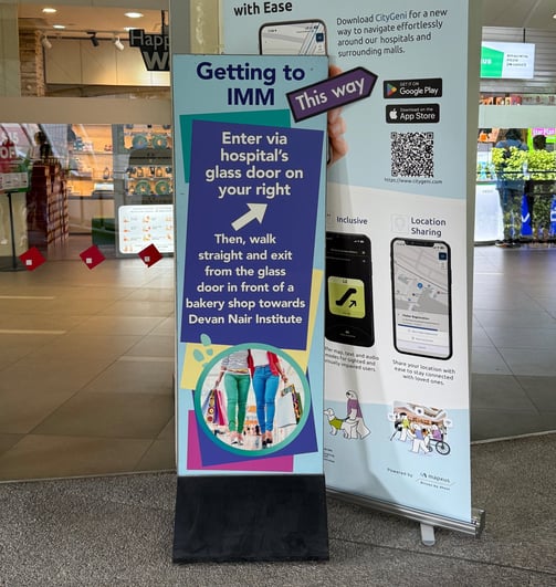
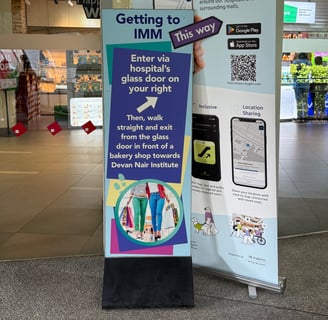
When Signs Become Instruction Manuals
What you see:
A standing sign, crammed with paragraphs of instructions, hastily added after opening; off-brand, ad hoc, and out of place.
What it signals:
This isn’t just a design flaw; it’s a symptom of a deeper problem. When operations teams resort to wordy, makeshift signage, it means the original wayfinding system isn’t working. Customers are confused, missing key destinations, or getting lost.
Why this doesn’t work:
People don’t read long instructions when they’re on the move. Faced with a wall of text, most will ignore the sign entirely or cluster around it, creating unnecessary bottlenecks and frustration.
How Studio Lucidus helps:
We ensure your wayfinding is clear from the start, so you never have to rely on last-minute, wordy fixes. Our expertise uncovers the real navigation challenges, helping you create environments where customers feel confident, not confused.
When Signs Can’t Be Read
What you see:
A newly installed directional sign, part of a multi-million dollar revamp. The text is hard to read due to poor colour contrast, rendering the sign ineffective.
What it signals:
No matter how much is invested in design, if signs are illegible, the wayfinding system fails at its most basic function. Poor legibility, often caused by insufficient contrast between text and background, leaves users struggling to find their way.
Why this doesn’t work:
When people can’t read the signs, frustration builds. Confused visitors may miss key locations, ask staff for directions, or simply give up. Worse, illegible signage reflects poorly on your brand, undermining the investment and leaving a lasting negative impression.
How Studio Lucidus helps:
We prioritise clarity and accessibility in every project, ensuring that your signage not only looks good but works for everyone. Our expertise prevents costly mistakes, so your investment delivers a seamless, positive experience for all users.
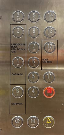
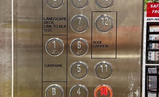
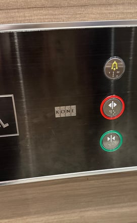
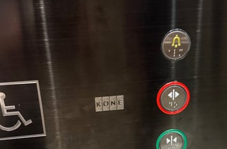
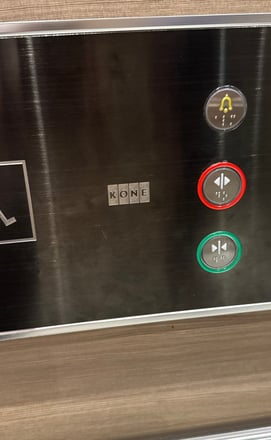
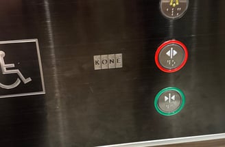
When Lift Buttons Cause Confusion
What you see:
A cluttered panel of lift buttons with poor layout, and lift door buttons where red means “open” and green means “close”, defying user expectations and causing frequent mistakes.
What it signals:
When lift controls are confusing or counterintuitive, users hesitate, press the wrong buttons, or inadvertently close the doors on others. This isn’t just a minor annoyance, it disrupts the flow of people throughout the building and signals a breakdown in the user experience.
Why this doesn’t work:
Delay due to user error can lead to longer wait times, unnecessary congestion, and growing frustration. Worse, they can create safety risks as people scramble to correct mistakes or rush through closing doors. These issues contributes negatively to the perception of your development.
How Studio Lucidus helps:
We understand that wayfinding is more than just signs, it’s about every touchpoint where users make decisions. Our expertise ensures that details as small as lift controls are logical, and accessible, supporting smooth vertical circulation and a positive experience for everyone.
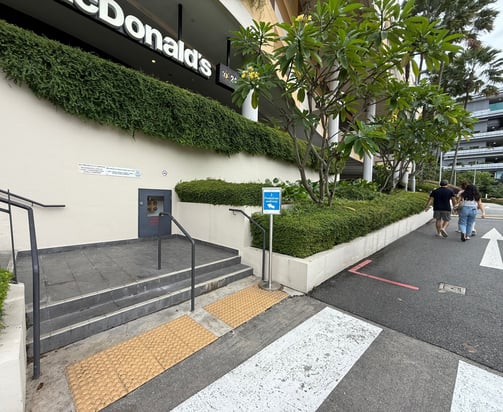
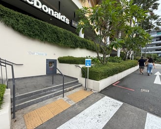
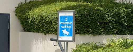
When Architecture Neglects Wayfinding
What you see:
A temporary paper sign reading “Pedestrian Walkway” points to a set of stairs, while pedestrians ignore it and walk up a sloped driveway instead, a clear sign that the environment isn’t guiding people as intended.
What it signals:
When developments rely on makeshift signs to direct movement, the real problem often runs deeper than poor signage. Effective wayfinding starts with the built environment itself. If architecture and landscaping don’t naturally guide people, no amount of temporary signage can compensate.
Why this doesn’t work:
People instinctively follow the path of least resistance. If stairs feel inconvenient or unsafe, they’ll choose the driveway, even if it’s not designed for pedestrians. Relying on paper signs as a “band-aid” solution leads to confusion, safety concerns, and a disjointed experience.
How Studio Lucidus helps:
We believe the most successful wayfinding is built into the DNA of a place. By collaborating with architects, landscapers, and project teams from the outset, we ensure that environments are intuitive to navigate, reducing the need for temporary fixes and creating spaces that work for everyone.

What you see:
A standing sign, crammed with paragraphs of instructions,
hastily added after opening;
off-brand, ad hoc, and out of place.
What it signals:
This isn’t just a design flaw; it’s a symptom of a deeper problem. When operations teams resort to wordy, makeshift signage, it means the
original wayfinding system isn’t working. Customers are confused, missing key destinations, or getting lost.
Why this doesn’t work:
People don’t read long instructions when they’re on the move. Faced with
a wall of text, most will ignore the sign entirely or cluster around it, creating unnecessary bottlenecks and frustration.
How Studio Lucidus helps:
We ensure your wayfinding is clear from the start, so you never have to rely on last-minute, wordy fixes. Our expertise uncovers the real navigation challenges, helping you create environments where customers feel confident, not confused.
When Signs Become Instruction Manuals
What you see:
A newly installed directional sign, part of a multi-million dollar revamp. The text is hard to read due to poor colour contrast, rendering the sign ineffective.
What it signals:
No matter how much is invested in design, if signs are illegible, the wayfinding system fails at its most basic function. Poor legibility, often caused by insufficient contrast between text and background, leaves users struggling to find their way.
Why this doesn’t work:
When people can’t read the signs, frustration builds. Confused visitors may miss key locations, ask staff for directions, or simply give up. Worse, illegible signage reflects poorly on your brand, undermining the investment and leaving a lasting negative impression.
How Studio Lucidus helps:
We prioritise clarity and accessibility in every project, ensuring that your signage not only looks good but works for everyone. Our expertise prevents costly mistakes, so your investment delivers a seamless, positive experience for all users.
When Signs Can’t Be Read
What you see:
A cluttered panel of lift buttons with poor layout, and lift door buttons where red means “open” and green means “close”, defying user expectations and causing frequent mistakes.
What it signals:
When lift controls are confusing or counterintuitive, users hesitate, press the wrong buttons, or inadvertently close the doors on others. This isn’t
just a minor annoyance, it disrupts
the flow of people throughout the building and signals a breakdown in
the user experience.
Why this doesn’t work:
Delay due to user error can lead to longer wait times, unnecessary congestion, and growing frustration. Worse, they can create safety risks as people scramble to correct mistakes or rush through closing doors.
These issues contributes negatively to the perception of your development.
How Studio Lucidus helps:
We understand that wayfinding is
more than just signs, it’s about every touchpoint where users make decisions. Our expertise ensures that details as small as lift controls are logical,
and accessible, supporting smooth vertical circulation and a positive experience for everyone.
When Lift Buttons
Cause Confusion
What you see:
A temporary paper sign reading “Pedestrian Walkway” points to a set
of stairs, while pedestrians ignore it
and walk up a sloped driveway instead,
a clear sign that the environment isn’t guiding people as intended.
What it signals:
When developments rely on makeshift signs to direct movement, the real problem often runs deeper than poor signage. Effective wayfinding starts with the built environment itself. If architecture and landscaping don’t naturally guide people, no amount of temporary signage can compensate.
Why this doesn’t work:
People instinctively follow the path
of least resistance. If stairs feel inconvenient or unsafe, they’ll choose the driveway, even if it’s not designed
for pedestrians. Relying on paper signs as a “band-aid” solution leads to confusion, safety concerns, and a disjointed experience.
How Studio Lucidus helps:
We believe the most successful wayfinding is built into the DNA of a place. By collaborating with architects, landscapers, and project teams from the outset, we ensure that environments are intuitive to navigate, reducing the need for temporary fixes and creating spaces that work for everyone.