

Inconsistent Level Naming Undermines User Confidence
One of the most common sources of confusion comes from inconsistent naming conventions. Many buildings mix B2, B3, G, LG, and UG in ways that feel inherited rather than intentional.
Individually, these labels make sense. Together, they create a puzzle.
Is UG above or below G? Does LG sit between B1 and G? Is “Ground” the true ground or simply another name for “Lobby”? These inconsistencies often stem from legacy planning, phased construction or imported terminology. But users do not care about a building’s historical layers. They just want to find their floor quickly, without decoding a secret language.
A lift panel that forces users to interpret its internal logic introduces uncertainty at the exact moment when clarity is needed. Consistency builds confidence. Inconsistency creates hesitation.


[Photo by Samuel Lim — Cheung Kong Center, Hong Kong]
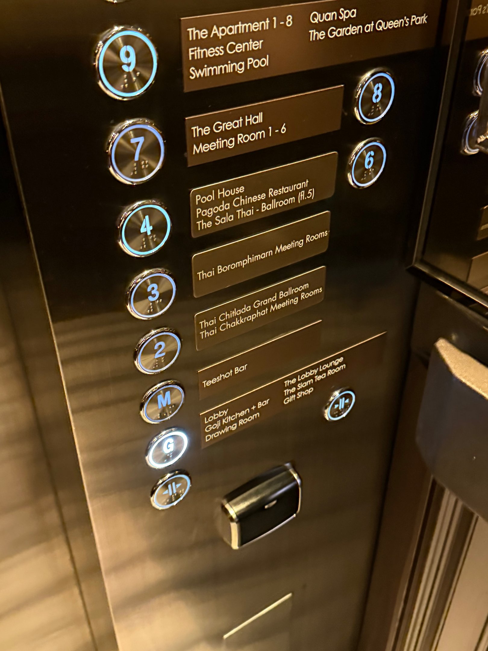
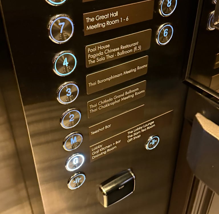
Button Layout Shapes How Quickly Users Make Decisions
Even when naming is clear, the arrangement of buttons determines how fast users find what they need. Panels that scatter floors seemingly at random force users into slow, exhaustive visual searches. Others interweave floors with amenities or access levels in ways that obscure hierarchy.
Lift buttons are micro-navigation systems. A predictable structure allows users to scan instinctively. A confusing one turns a simple action into a split-second puzzle, one that feels much longer when people are waiting behind you.
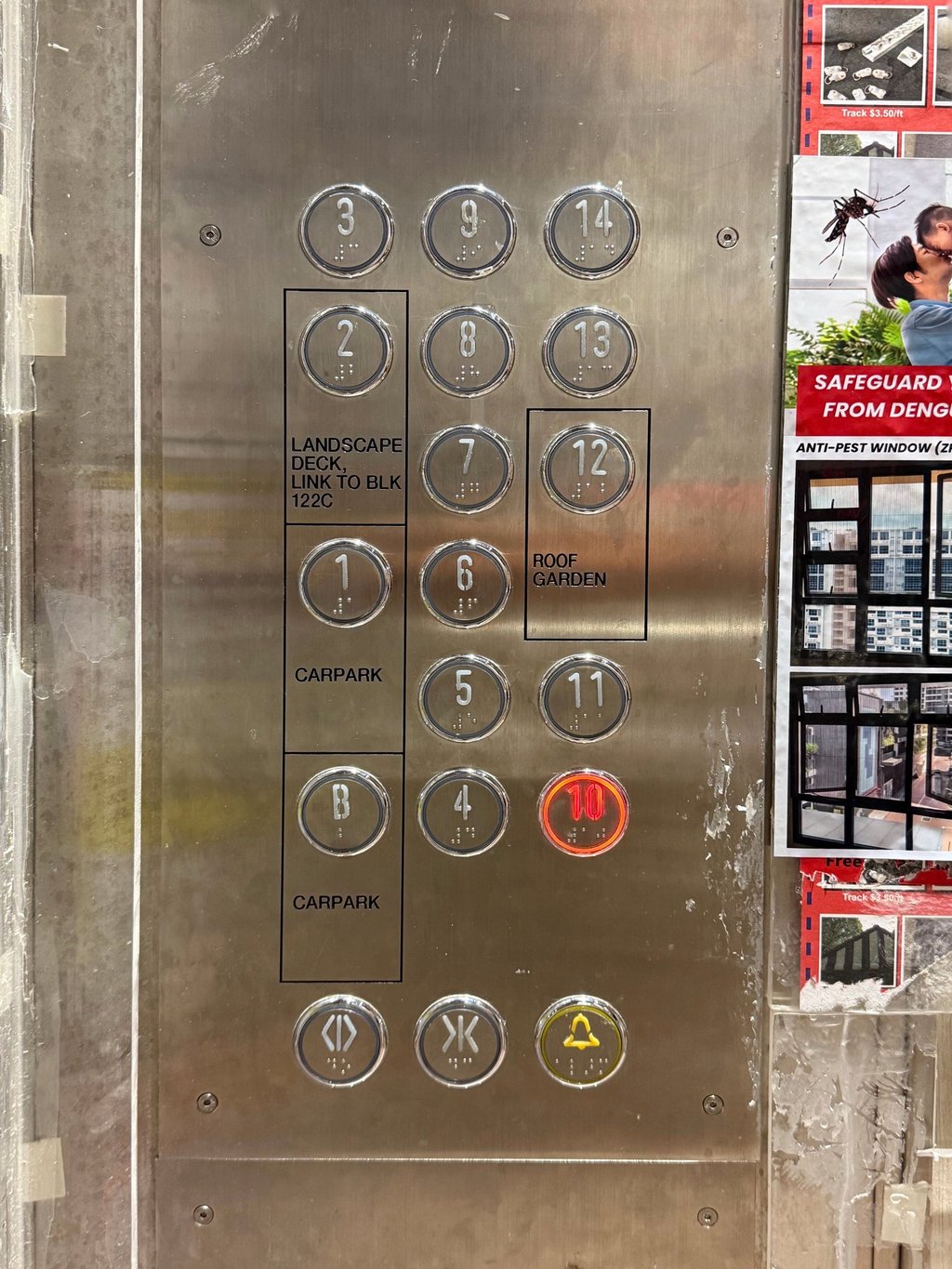
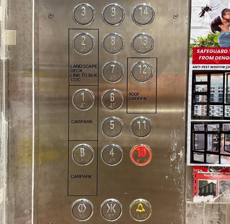
[Photo by Samuel Lim — Tengah Plantation, Singapore]
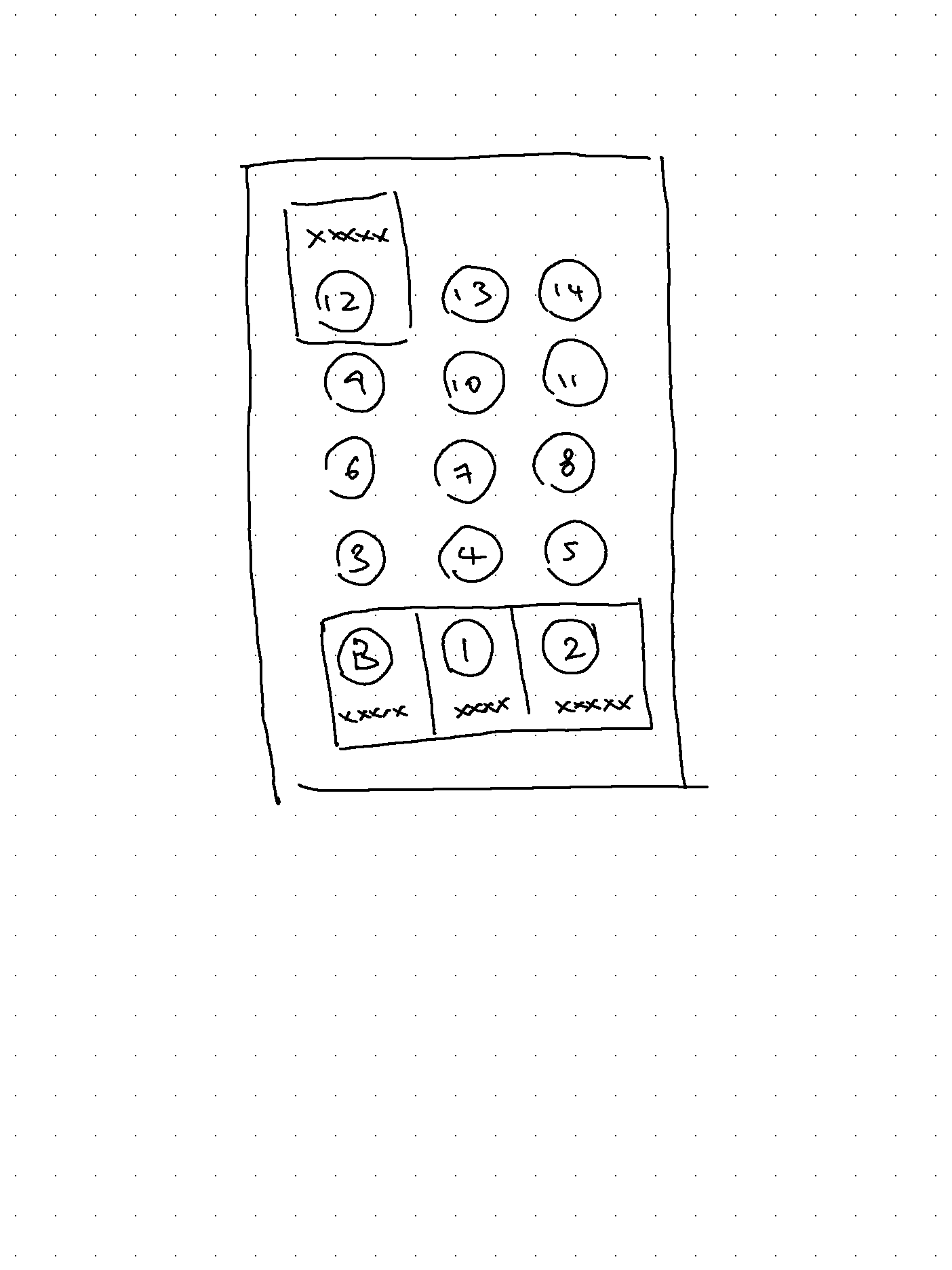
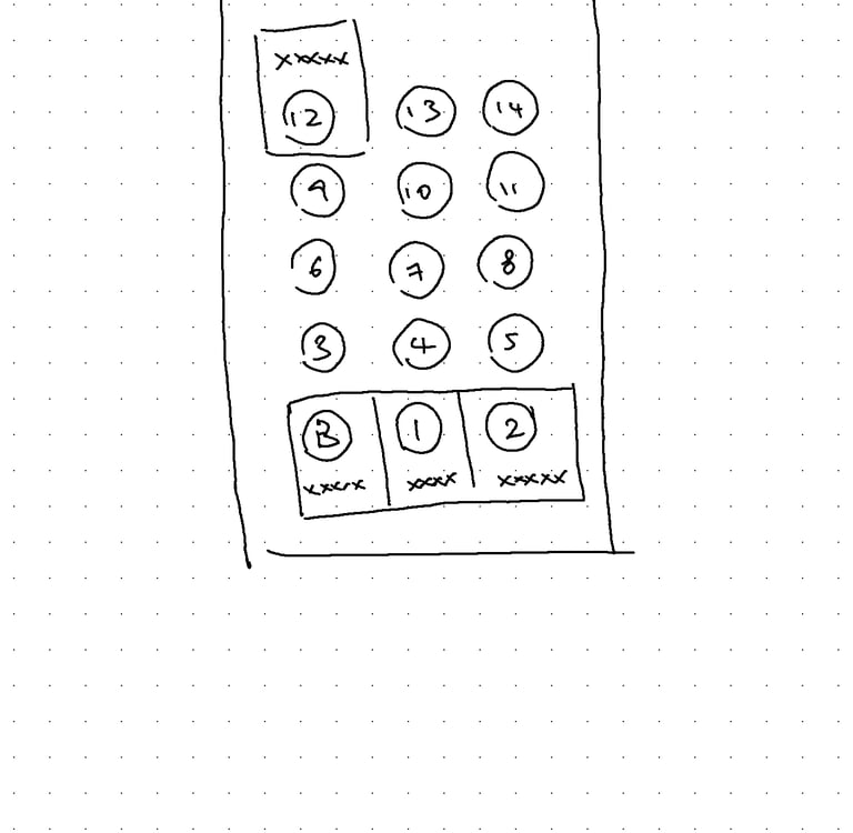
[Illustration by Samuel Lim —
I would've done it this way instead]
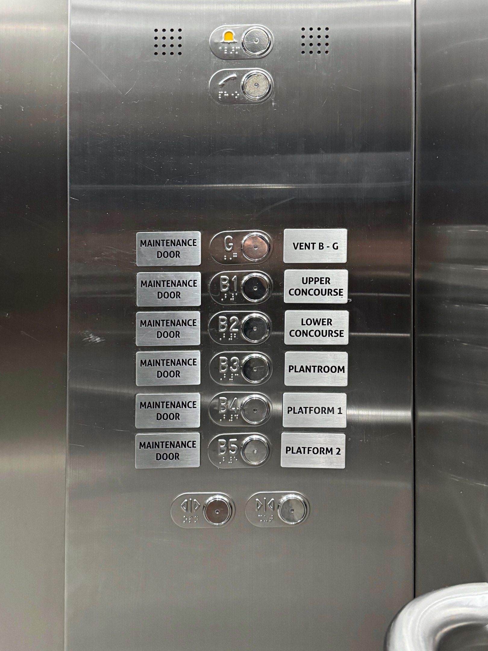
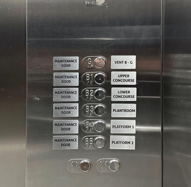
Too Much Information Creates Avoidable Cognitive Load
Some panels overwhelm users by presenting every possible destination: ventilation levels, maintenance doors, back-of-house spaces and operational zones. These buttons may be meaningful to staff but introduce unnecessary noise for the public.
Users should not have to filter out irrelevant information. A well-designed panel does that work for them. Simpler interfaces reduce errors, speed up decisions and keep attention focused on what truly matters.

Ambiguous Door Controls Introduce Unnecessary Risk
Door open and close buttons are among the most sensitive elements on a lift panel. They are used in moments of urgency, courtesy or safety — yet many lifts rely on nearly identical icons that force users to hesitate.
When doors are closing on a person, stroller or luggage trolley, hesitation is dangerous. These controls need unambiguous visuals and strong differentiation. Users should know instantly and instinctively which button performs which function.
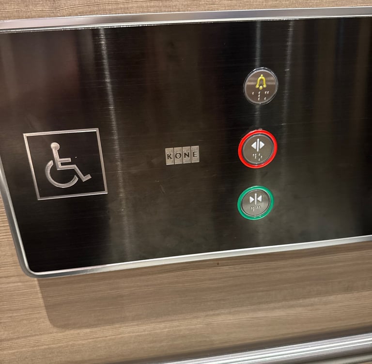
[Photo by Samuel Lim — Marriott Marquis, Bangkok]
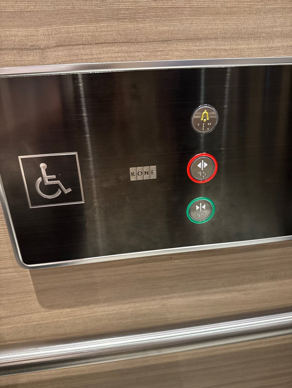

Speaking of instinct, does the colour red mean “close” or “open”?
[Photo by Samuel Lim — Farrer Park Hospital, Singapore]
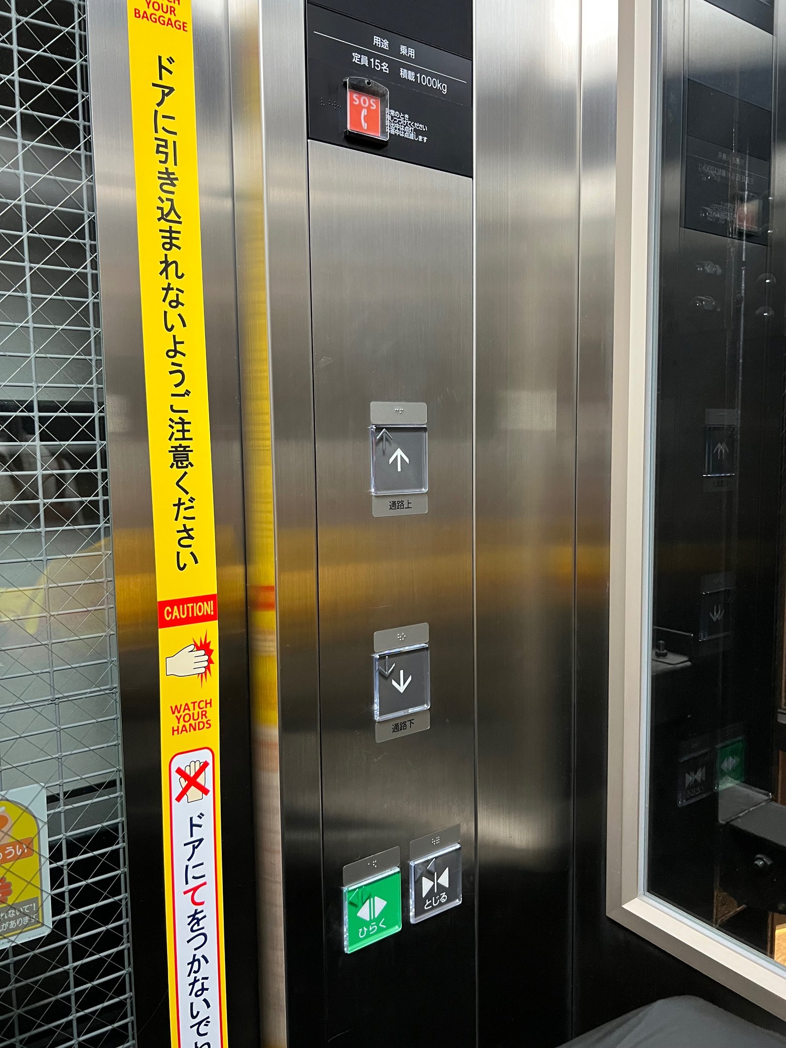
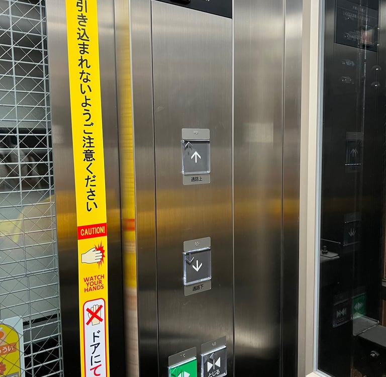
Simplicity May Not Be Immediately Obvious
Not all lift panels are confusing. Some are refreshingly direct.
Certain systems demonstrate how effortless the interaction can be when the design embraces simplicity. Panels that present only the essential decisions (such as “up” or “down”) are instantly understandable regardless of language, familiarity or stress level.
Simplicity is not a compromise. It is a strategy. When designers remove unnecessary detail, users move confidently and the system performs better.
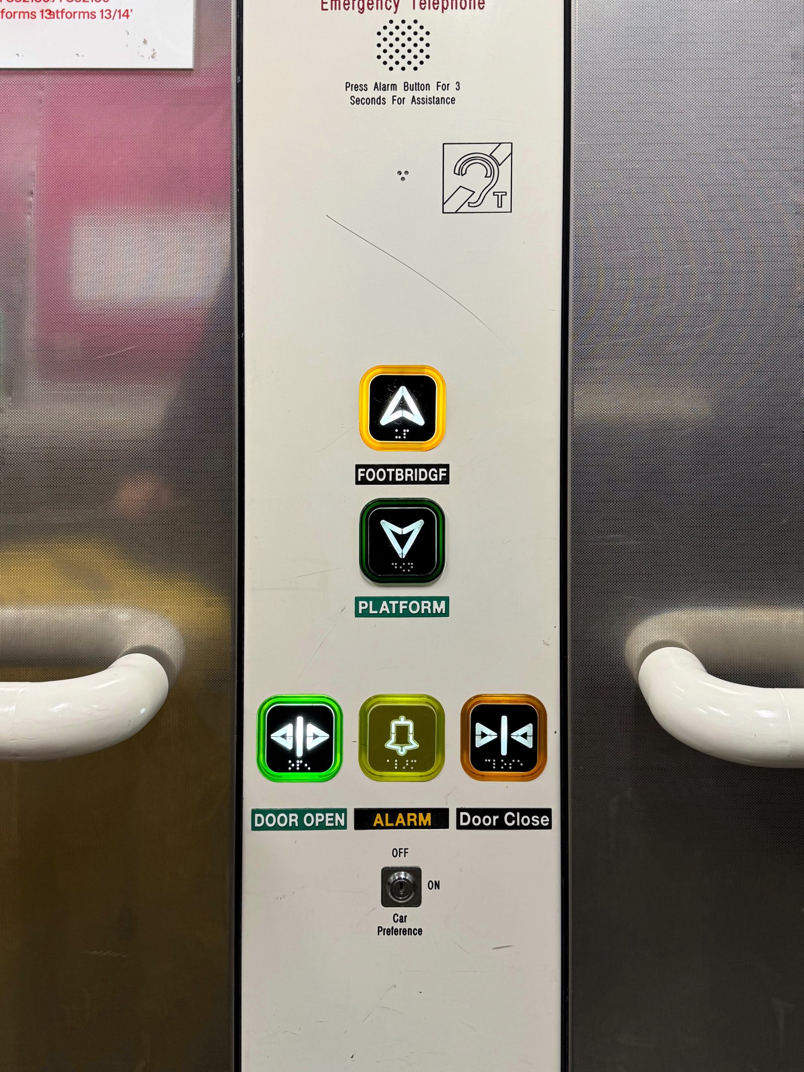
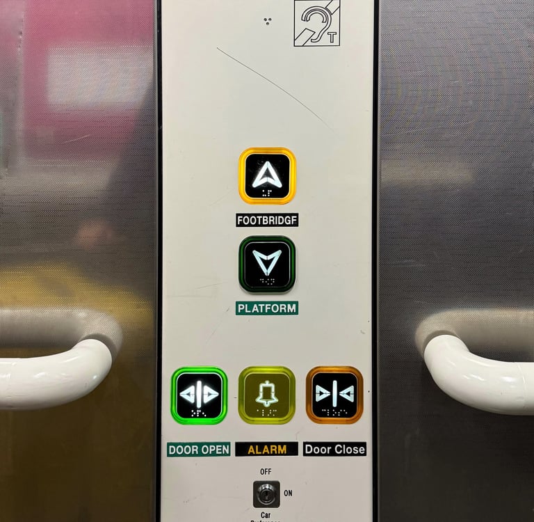
[Photo by Samuel Lim — Piccadilly Station, Manchester]
[Photo by Samuel Lim — Tokyo Staton, Tokyo]
Why Getting This Right Matters
Lift buttons may seem trivial, but they shape micro-experiences that accumulate over time. Poor naming conventions, unclear layouts, information overload and ambiguous controls all contribute to friction that users quietly absorb through hesitation and confusion.
Improving these details doesn’t require new technology. It requires intent. When we design with clarity, predictability and user confidence in mind, even the smallest interface becomes an opportunity to create a better environment.
© 2026 Studio Lucidus Pte Ltd